In my last post (I seem to be stuck on a two-week pace now) I wrote about taking on a new commission with a very abbreviated timeline. As a result, I’ve been pushing myself to make without hesitation; to believe that I can, and will, find my way to something that sings, without long bouts of contemplation (and second guessing). It’s never my preference to craft under a deadline (knitting, sewing, quilting or otherwise) but I’m always interested in using a constriction of some kind as an avenue for learning something. And a June deadline for a finished quilt certainly counts as a constriction!
I selected a palette from my existing fabric stash (the largest one I’ve ever had, thanks to the last two years of “fuck it, if I want it, I buy it” attitude) — and decided to start with sawtooth stars, as I said. I’ve been nostalgic for simple stars for a while, but I made this decision based on other strictly logical considerations, too: HSTs are a nearly infinitely adaptable base, and can be made very efficiently 8 at a time. And here you have the additional constrictions: No new fabrics; HST batching (normally, I never “batch-make” anything, having too strong a preference for variation); and most importantly, making blocks rapidly, trusting that once they exist they will tell me what to do with them.
I set out to make 25 stars (13” finished block), with a 5x5 grid in mind. That would bring us to 65” square for the top — my new go-to, favorite quilt size (more on that later). I powered through cutting and sewing and cutting again my 8-at-a-time HSTs in a matter of days, and began to make stars. Carefully and uniformly at first, then with more and more playfulness. By the time I had 18 of them, I felt I could start arranging them on the wall, which I did. And did, and did, and did.
It did not take me long to determine that the straightforward field of stars approach was not going to be it. While I love this style of quilt — and am determined to make many in my lifetime — my original palette lacked certain elements that I had failed to predict the broader applications of, in this style of arrangement. There was a “dinginess” to the overall effect; I lacked highlights, or any moments of brightness to move the eye around effectively. Frankly, at this stage, my choices bored me. I always need something,.. unexpected.
It was at this point that I added just a few touches of yellow — a single sunny triangle, and a few more in shiny gold silk. This helped, certainly, but I was still not excited. Nothing was pushing against each other the way I like best in quilt compositions.
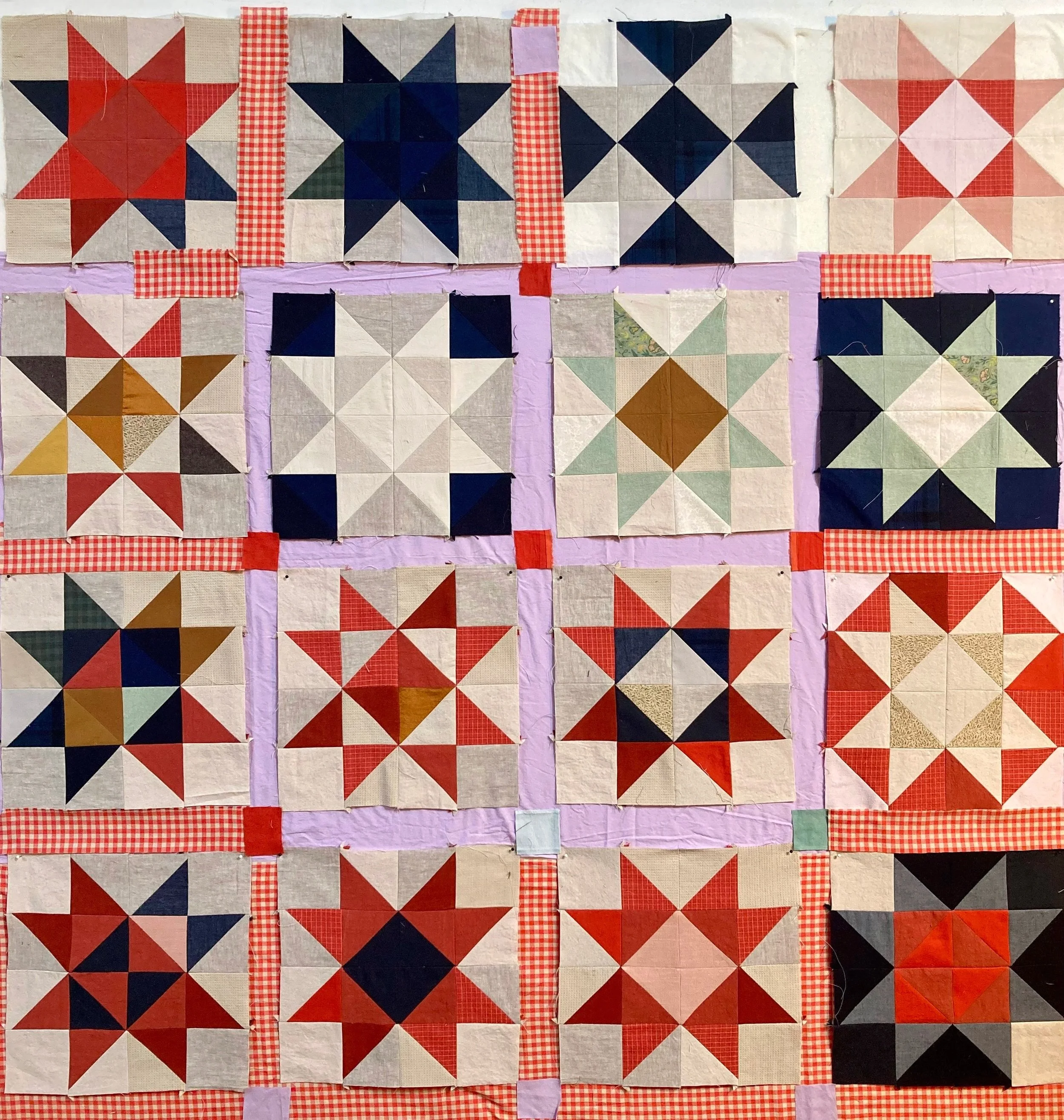
I decided to consider sashing. It’s not historically been a part of my design considerations but I see it used to great effect often, and am trying to learn to use it well myself. I took all my stars down off the wall and instead tacked up large pieces of yardage as backdrop, to arrange the pieces over, thereby creating the option to look at different arrangements and different possible sashing widths or orientations.
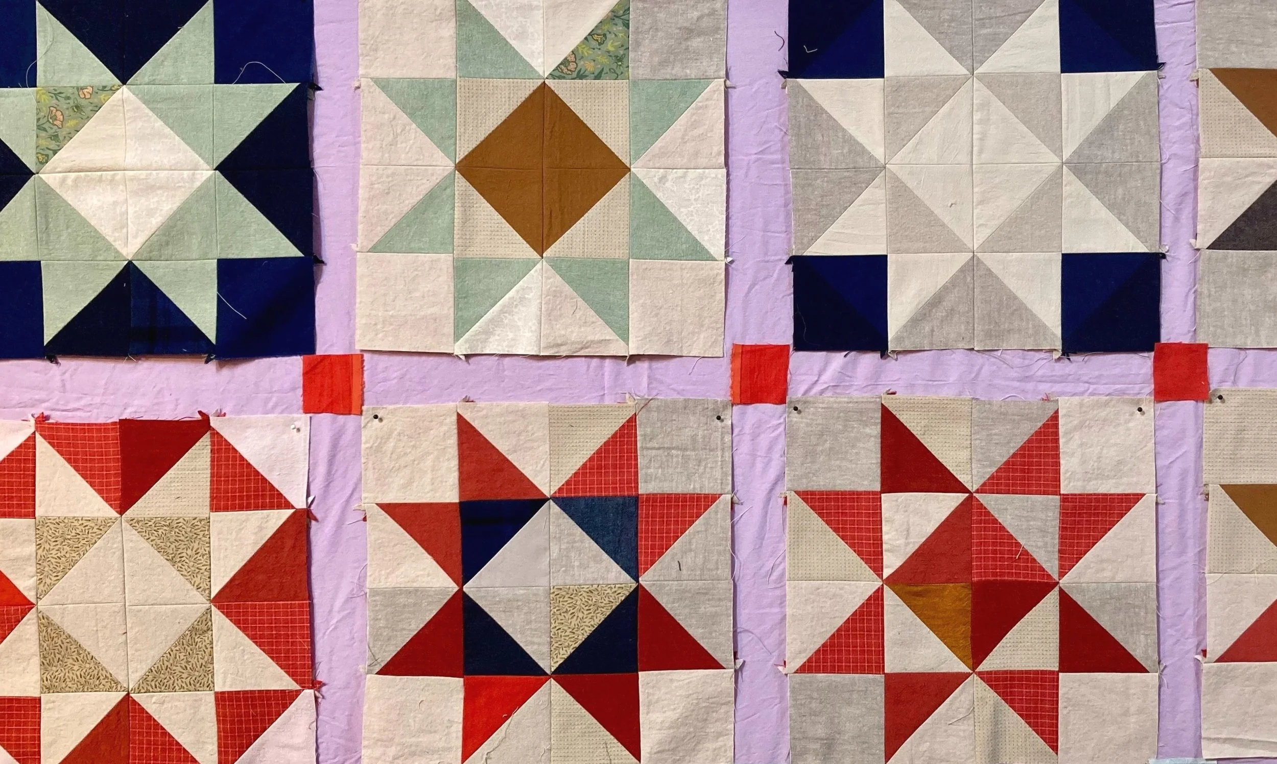
The lilac, somehow, was my first go to. I have always ranked purple as one of my most hated of all colors, but suddenly there are shades of a specific light, dusty purple that I simply need to press into my life, find myself seeking out. (I blame acid yellow.) One of the many things I came home with from my birthday trip was what may have been a twin-sized lilac top sheet, though I can’t really be sure. (It may just be wide yardage that was hemmed? We’ll never know.) I pinned it up on the wall and put the blocks atop it. I loved the outcome, but I didn’t want to commit to the first thing I tried. I also was afraid of a giant sea of lilac — too twee? So I repeated the exercise with the vermillion gingham purchased on the same trip; and ooh, I liked that, too. And then, instead of having two options to choose between, suddenly I had a relationship to work out.
The lilac erased the dingy, “flat” feeling. The brightness of the lilac pushes against these neutral tones in a confusing way for the eye — because, I imagine, the tonal quality of these fabrics is nearly the same, but the brightness and vibrancy is different? I find this visual confusion pleasurable (in my developing aesthetic, I consider it important). Together they sort of hum, in your visual field, not creating an obvious foreground or background, but instead a sort of impression of float. By contrast you can see how this differs from the gingham quadrants, where the star blocks sit firmly visually “atop” the gingham background. (I find a similar effect — the foreground/background confusion — in the lilac tones of this quilt, which I love.)
After sewing the top together last weekend and putting it back on the wall, it also told me that “enough” is never enough. I went home that night with the question of “what else” still on the brain, drew out a black and white version on graph paper, and decided it needed a border. A brief experiment on the wall (above) a few days later proved the theory. So tomorrow is 7am studio Saturday, and we’ll see if we can’t make that a reality in one fell (ten hour) swoop.
All in all my goal is to have the first quilting stitches chewing into it by the time the calendar turns over to May. This will be an unheard of pace; from initial conversation of the commission to finished quilt top in 5 weeks. If you had asked me if it were possible (for me, personally) I would’ve said no. But I have in fact been deeply enjoying the breakneck speed, and the quick commitments. I have a secret goal to try to repeat this exercise as soon as this piece is down off the wall; I think Acid Vat (which you can see hiding in the shadowy corner above) would greatly benefit from this same treatment. Here’s to a new container — in this case, speed? — within which to learn something.


